Starting a new project can be a very daunting experience, even for the most experienced developer. The first time you sit down and try to figure out everything that needs doing, before, now, and then, can be very overwhelming.
You have expectations to come up with a good plan to get the most productivity out of the team, estimate how long it will take, figure out team sizes, release dates, processes to use... the list can go on and on. Over the years, I have found the best way to start a project is to try and break everything down into small manageable chunks.
My starting point is to get the design and break it down into the Episerver components that will need to build. After you have a list of components, you can create a common terminology for the different pages and blocks that the team can start using, you can start to produce estimates as you can start putting times against the components you'll need to develop and if you need to write a spec, you have the beginnings of a document that you add more details to.
A component catalog was an idea I came up with for a one-off project as we didn't have time to write a full spec. That document ended up being called the project bible as we had a client based in Manchester, a dev team in Poland and a third party design agency. Even on a big project, it usually only takes me a day or two to knock one up. The point of the document is not lots of text that no one ever reads, it's a very visual document that identifies all the page types you need to build and then breaks that down into the components that make up each page.
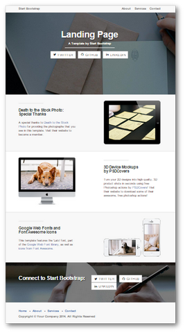
Today, I'm going to walk you through how to create a component diagram using a simple webpage and using one of the free bootstrap templates available. If you want to download them you can do so by using the Start Bootstrap Landing Page. Today's webpage is going to look like this:
Getting Started
Ideally, I like to create a component catalog in confluence. People can add comments and it can easily be accessed by everyone. I usually start by creating a page called Component Catalogue and under that create 3 child pages, Page Types, Blocks, and Shared. Pages and blocks should hopefully be quite obvious, but the shared page might need a bit more explaining.
In the shared folder I breakdown the header and footer and anything else that might be shared between multiple pages. In today's exercise, we'll be creating a Home Page Type under our pages section. The first section is called the desktop view and will break the page down as follows:
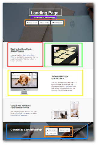
I use a tool called LightShot to take the screenshots and color outline the boxes. It's a great tool as you can create your diagram very quickly. I'll then create a table underneath the desktop view that labels what each component is called and how it's configured.
|--- |--- |--- |--- | |Colour|Type|Name|Orientation| |Grey|Homepage Property|Main Heading|| |Purple|Homepage Property|Sub Heading|| |Orange|Block|Social Links Button|Full Width| |Red|Block|Text Block|Half Width| |Green|Block|Image Block|Half Width| |Yellow|Block|Call To Action|Full Width| |Blue|Block|Banner Block|Full Width|
I've broken the page down several ways to help you to understand the concepts. If we're going to do this in real life, I may not have used a Call To Action Block. If I'm using confluence, then for each bloc I'll create a link to that page. If I have to do my components catalogue in a work document, I'd add section numbers to the document and add a column with the appropriate section number for each block.
Explaining My Decision
The first two boxes I've ticked off are both properties of the home page itself, this is a header and sub header. These will be added to the homepage page type as two string properties. Under that we have the orange box that I've called the social buttons plug-in. I would design this block so extra buttons could be added and the buttons currently displayed could be hidden.
In every project, you always need a text and image block. I've added them in here to help you see a lot of the dilemmas you might find yourself under. You can either build pages using text and images set at half width by the content editor. Or you can create a call to action block that encapsulates all the properties the block needs in a single place.
In a real project, I would usually favour creating one block that does everything, rather than letting the content editors have to manually build a page up. If the site you are architecturing gets updated every day, making the process as easy and as streamlined for content editors is just as important as designing a usable site.
Instead of going into code, we've taken a bit of a step back and started to think about how to create your Episerver site at an architectural level. The component catalogue is very useful and an easy document to create. It doesn't take you weeks to write it and in most circumstances, you can write it up in a day or two.
After you've broken the site up, you are then in a position of knowing exactly all the front end components you need. My usual next step is to then start figuring out how these blocks will work with back-end services.
When you start doing the development and you need to share out the work, you can point people to appropriate sections in your component catalogue. What do you think of a component catalogue, how do you normally break your website down? Do you believe in specs or just figuring it out as you go in each sprint? Leave your thoughts in the comments section below.