When I'm working on a project, I always recommend that the HTML should be done in a seperate static HTML site first. When the HTML is ready it can be integrated after it's completed. Many people are tempted to start writing the HTML and CSS directly in Episerver. This approach never seems to work well for the team. The static site is useful for several key reasons:
It allows front-end developers to work quickly using the tools that they know. They do not need to constantly wait for a .Net page to load
The front end developer doesn't need to know how to use Visual Studio (or have a license)
When bugs are found, especially responsive stuff, it is much quicker and easier to test the HTML in a static page, compared to when it is intergrated into multlple view files. A front end developer needs to understand your site's page and block types, which isn't always easy for everyone to understand
You can fully test your site in all browsers and devices before you move it into Episerver. This is a major time saver, if you need to change HTML due to bugs, it can be a lot more time consuming fixing them in Episerver. Trust Me!
Where should we store the static site?
After agreeing to use a static site on a project, the next question is usually where to create it. For this, I recommend creating a folder in your websites solution called Static or UI (name it whatever makes you happy 😊 and putting all the HTML in there. The HTML can then reference the same CSS and JS files as the main Episerver website. This has the benefit later in the project that front-end developers can fix things once in the static version and, in the majority of cases, that will also fix the Episerver versions bug as well.
Avoid Different Mark-up Between Desktop and Mobile
On a recent project, we had a front-end developer who was very new to Episerver and for every component on the page, created HTML for a desktop view and separate HTML for a mobile view. Asides from creating more mark-up, this makes life a lot harder/impossible to integrate the HTML into the CMS. When designing for Episerver aim to keep the HTML the same between desktpo and mobile and use css to smaek it look correct. This might make the CSS a lot more complex, however, unfortunately, that is one of the downsides of the new fully flexible world 🤔
Content Areas render extra div's
After you start integrating HTML, the extra div issue is usually one the biggest headache. To get the preview and on-page editing to work in the Episerver editor, Episerver renders two extra div's on top and below of every content area. These unexpected tags tends to break things. I have written a blog post (Episerver 7 : Extra div's in content area how to remove them ?) detailing the available options on how to handle them. Read that for more information!
If you do not want to follow the approaches in that tutorial, the next best solution is to simply add the extra div's into the static site into the areas that will use the content area property. The benefit of this approach is that the CSS and HTML will be the same in the static site and the Episerver site, making life easier. Typically I have found that when you branch the HTML in different directions, you'll be in a world of trouble.
Another benefit of the static site is that, in the future, you can use it to test new design ideas and add new pages simply without affecting the main website. If you the HTML and the CSS starts to differ, the benefits of the static site are less.
Create a Row block
If you want to create a fully responsive site, and you need to support earlier versions of IE, I recommend you get your BE developer to create a custom row block in the CMS. A row block is a very basic block that simply contains a div with a row class on it and a content area inside the tags. A lot of people who don't understand grids struggle with the concept of creating the row block in the back-end, so bear with me 🙏
In EPiServer 7 onwards, content editors now have the power to drop as many blocks (if applicable for your site, in different sizes) into a content area as they please. Just like a spreadsheet, we have columns and rows that make up our sheet. In a responsive page, a dynamic grid works exactly the same, columns and rows. In Bootstrap, the grid can have a maximum of 12 columns that make up the width of your page. You can also have an unlimited number of rows. If you want to have two components in the same row that takes the width of the page, you would create a new row and make each component have a class set to display at 6 columns widths each (two components of 6, make up the full 12 column width to get a full-screen display).
When we work with content editors who can drop as many blocks as they want to inside a content area, you need a way to ensure they do not add blocks that exceed the 12 column rule. If a content editor added 5 full-width blocks within a content area (which they can) you would end up with a row that would have a column width of 60. How does this row render? Does it have issues? Who knows 🤷
Ideally, you want to prevent content editors from being able to break the rules of the responsive grid when adding blocks. This is the reason why you should create the row block. On most of my projects, I'll set all my content areas to only a row blockto be created inside of it. To add a block onto a page, they need to create a row block first. In the content area in the row block, I add a custom validator. The validator stops the page from saving if the rows are greater than 12. This adds a little bit more overhead for content editors, however, on the flip side, the page will look correct 🖼️
By preventing any other block except a row block to be dropped inside a content area, you can then ensure that all your components will be wrapped inside a row and will work responsively in your 12 column grid layout. The code to create a row block might look something like this:
Dummy Page:
Row Block:
The View:
Learning How To Structure the grid
On all of the projects that I have worked on, grid structure is usually the second biggest pain point. In a normal static site, front-end developers can do what they want to in terms of CSS styling. Life is pretty straightforward. For the back-end developer who has to integrate the HTML, they do not have this luxury. Back-end developers work with dynamic content.
Content editors can drop a range of blocks onto a page and arrange them how they want to (what's the point of a CMS if they couldn't). Testing the difference in permutations, between the well known static layout path, compared to the random nature of content editors, is a frequent source of bugs and frustration. In basic terms... when it comes to rendering elements in the CMS, applying a particular CSS class in a particular scope isn't always possible. From my experience of integrating static HTML, the pain points are use selectors that target the last element dynamically.
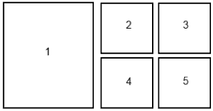
For example, hiding different elements in tablet and mobile views. In the example above, it's very common to have a requirement to hide elements 2 and 3 in tablet or mobile. Writing a specific CSS class to hide something is simple, however, depending on what components a content editor creates, the mark-up might not match the status HTML. Adding a specific class to the last HTML element can be difficult for a BE. Applying a last class is a classic example of something that is easy to implement on the static site and a lot more tricky in the back-end. A better approach is to hide the last two elements in the sequence using CSS selectors (4 and 5). If the CSS can target the last two blocks rather than trying to do some complicated logic to apply a special class, the backend logic will be a lot cleaner. 😊
It's these very subtle changes of how you can write your CSS that can make everyone's life much happier and also get your project out the door a lot quicker. As we have seen when integrating CSS and HTML into Episerver, it will be very likely you'll encounter a few issues along the way. Following some of the principles in this guide should save you a lot of frustration and save valuable time for all parties involved in the project. These slight restructuring tweaks may seem trivial but can save hours of integration woes. So there you have it.. good luck with your project! Do you have any integration horror stories or tips? Share your ideas in the comment section below. Happy Coding 🤘